
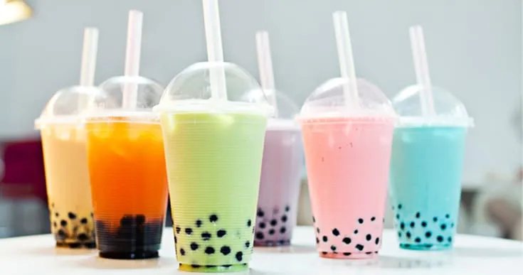
Choosing food coloring for drinks is not only a formulation decision; packaging can change how the finished shade is perceived over time. A clear bottle exposes the beverage to more light than a can or opaque carton, while the product’s pH, ingredients, and storage temperature create another set of conditions. FoodRGB develops natural color systems for beverages, but a promising bench sample still needs to be checked in its intended package. That simple step can reveal whether a color that looks bright on day one remains suitable later.
Clear Drinks Show Small Differences
Transparent beverages leave very little room for visual inconsistency. A slight shift in hue, haze, or concentration can be easier to notice than it would be in a smoothie or dairy drink. Minerals, acids, botanical extracts, and sweeteners may also alter how the color appears once the full recipe is complete. Developers should therefore compare samples under the same lighting and in the same bottle planned for sale. Looking at the drink against both light and dark backgrounds can make subtle changes easier to spot during evaluation.
Cloudy Beverages Can Soften Color
Juices, smoothies, protein drinks and other cloudy beverages behave differently because suspended solids and opacity scatter light. A pigment that looks intense in water may appear softer after fruit puree, protein, or plant ingredients are added. That does not always mean more color is needed. Increasing dosage too quickly can push the shade too far once the product settles or is viewed under light. Testing two or three concentrations in the finished base gives developers a better sense of which level looks balanced rather than simply strongest.
Red Radish Offers a Useful Case Study
When a beverage needs a natural red food color, FoodRGB’s Radish Red provides one option for developers to test. The company describes it as water-soluble, with red-to-fuchsia shades and a stated working pH range of about 3.0 to 8.0. It is available in several powder strengths, liquid forms, an oil format, and custom formulations. Because beverage formulas can vary widely in acidity and clarity, the color should be evaluated in the final drink instead of being selected only from its technical range or concentrated appearance.
Heat and Filling Conditions Matter
Packaging decisions often sit beside processing decisions. A beverage may be cold filled, hot filled, pasteurized, or exposed to another thermal step before the cap goes on. FoodRGB notes that standard Radish Red is heat resistant rather than fully heat stable, while an improved heat-stability powder is also available. That distinction is useful during development. Teams should run the chosen version through the actual time and temperature used on the line, then compare the color again after cooling and once the drink is inside its final package.
Light Exposure Should Be Tested Directly
Shelf lighting can be difficult to reproduce with a laboratory check, so packaged samples deserve time under realistic conditions. Clear bottles may receive light during distribution or retail display, while cans and cartons largely shield the beverage. Developers can keep matched samples in different light conditions and review them at planned intervals. The goal is not to create an artificial stress test unless one is required, but to understand whether the chosen pigment maintains an acceptable appearance during the product’s expected journey from filling line to customer.
Scale Can Change Color Uniformity
A successful bottle made from a small trial does not guarantee that a full tank will look identical. Larger batches introduce different mixing patterns, longer transfers, and more opportunity for concentration differences if the color is not dispersed evenly. Pilot runs should include samples from the beginning, middle, and end of filling where practical. If the shade varies, changing the addition order, pre-dispersion step or mixing time may solve the issue. That is usually more useful than increasing color simply to compensate for uneven distribution across the batch.
Conclusion
Packaging should be part of natural beverage color development from the beginning, not an afterthought once the formula is finished. Clear and opaque containers create different light environments, while acidity, heat, ingredients, and scale can change how the shade appears before the drink reaches the shelf. Manufacturers can use foodrgb.com to review natural color options and application support for beverage development. Testing the real recipe in the real package, through processing and storage, gives teams a stronger basis for approving a color that remains dependable in commercial use.